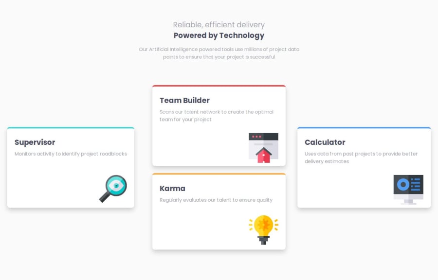
Four Card Feature Section using HTML, CSS & Flexbox
Design comparison
Community feedback
- @LesSylPosted about 2 months ago
Hi, you have done a good job, whereas the first thing that catches the eye is the Supervisor card. On larger screens, it is stuck to the left edge. Personally, I would have used a grid in this design. More information here: CSS Grid Layout Module,
it is good practice to use a naming convention such as BEM (Block, Element, Modifier) is beneficial as it makes the CSS more organised, readable and easier to maintain. BEM helps to clearly understand the purpose of each class, avoid naming conflicts and create reusable components, leading to a more scalable code base. More details here: BEM,
using rem or em units in @media queries is better than px because they are relative units that adapt to user settings, like their preferred font size. This makes your design more responsive and accessible, ensuring it looks good on different devices and respects user preferences.
Good luck!
Marked as helpful1@hazhir00Posted about 2 months ago@LesSyl Hi, I was trying to use Flexbox only for this challenge to practice it more.
I had no idea about BEM, so thank you very much; it helps a lot!
The issue with using rem and em in media queries is that I am accustomed to those units. However, you mentioned a reasonable point, and I will start using them from now on.
Thanks again 🙏
0 - @MaulidFajarPosted about 2 months ago
For the icon on the article, I think it's better to reduce the size of the icon a little.
Marked as helpful1
Please log in to post a comment
Log in with GitHubJoin our Discord community
Join thousands of Frontend Mentor community members taking the challenges, sharing resources, helping each other, and chatting about all things front-end!
Join our Discord
