Submitted over 2 years ago
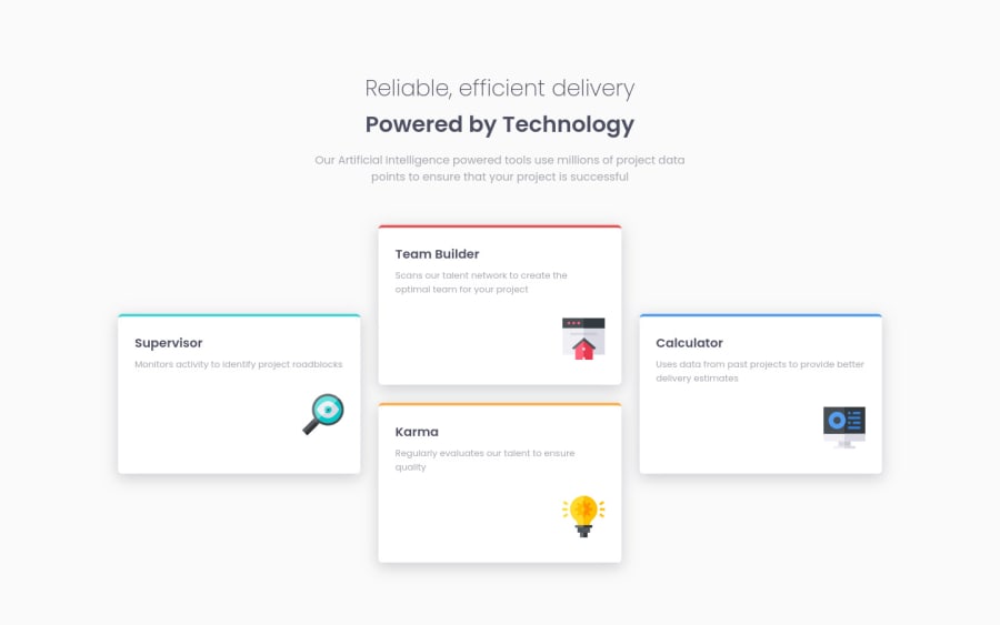
Four Card Feature Section using HTML, CSS and CSS Grid
@wesleyjacoby
Design comparison
SolutionDesign
Solution retrospective
This differed from the other projects I've completed, so it was an enjoyable challenge.
The only thing I'm not too sure that I did right was the border color on the top of the cards. It's hard to tell from the design image, but it looks as if the borders are inset?
I tried using border-top-style: inset, but that made the colors very dark. I'm not sure why though?
Thanks for the help!
Community feedback
Please log in to post a comment
Log in with GitHubJoin our Discord community
Join thousands of Frontend Mentor community members taking the challenges, sharing resources, helping each other, and chatting about all things front-end!
Join our Discord
