Submitted over 2 years ago
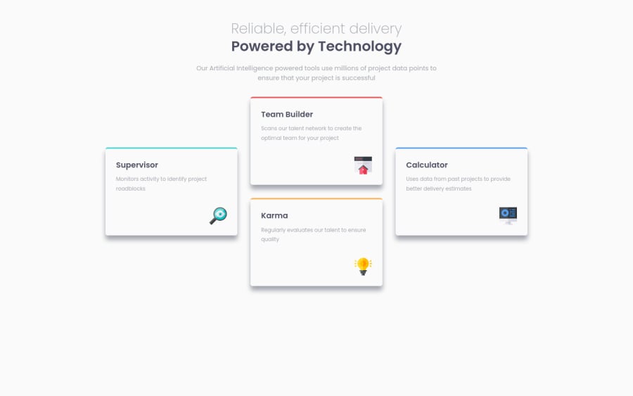
Four card feature section using HTML and CSS
@adil-khursheed
Design comparison
SolutionDesign
Community feedback
- @correlucasPosted over 2 years ago
👾Hello Adil Khursheed, congratulations for your new solution!
Here's my tips for you to fix the container aligment:
Use these properties to give the container some alignment,
Flexfor the alignment andmin-height: 100vhto align the componentbody { display: flex; /* width: 100vw; */ min-height: 100vh; background-color: var(--very-light-gray); padding: 3rem 5rem; align-items: center; justify-content: center; flex-direction: column; }👋 I hope this helps you and happy coding!
Marked as helpful0@adil-khursheedPosted over 2 years ago@correlucas Thank you so much Lucas. That really helps. I have done the necessary changes in my code.
0
Please log in to post a comment
Log in with GitHubJoin our Discord community
Join thousands of Frontend Mentor community members taking the challenges, sharing resources, helping each other, and chatting about all things front-end!
Join our Discord
