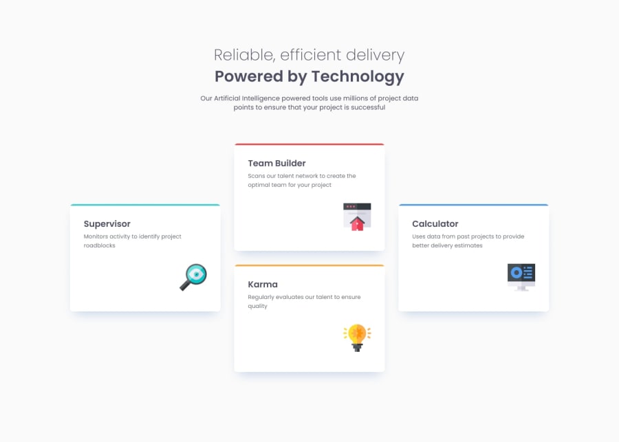
Design comparison
Community feedback
- P@NikitaVologdinPosted 7 months ago
Hi @Soniawan!
Great job on the design! The grid layout looks awesome. I have a few suggestions for improvement:
-
Background: I noticed a difference in background color between the solution and the design. Designs – background-color: hsl(0, 0%, 98%);
-
Font Imports: I noticed a difference in background color between the solution and the design slider. For the font family, instead of importing all styles, we can refer to the style guide (style-guide.md) to see which styles are needed for this project (200, 400, and 600). In Google Fonts, when you're embedding the font family, you can choose only the styles you need in the "Styles" section on the left side. This will prevent unnecessary downloads for users and improve initial load times.
-
H1 Font Size: The H1 font size on the desktop version should be 36px, not 32px.
-
Letter Spacing: I noticed some small letter spacings for the H1 and hero paragraph in the design (0.25px and 0.1px respectively).
-
Border Radius: The top border radius might be a little tricky, but here's what I suggest:
CSS border-top-left-radius: 10px 1%; border-top-right-radius: 10px 1%; Use code with caution.
There's also a slight difference in the bottom border radius between the design and your development. You can use 8px for the bottom border radius (border-bottom-left-radius: 8px; border-bottom-right-radius: 8px;).
Here's some information about elliptical shapes for border radius if you're interested: link to Mozilla Developer Network article on border-radius
Cool work with the root variables! I especially like your box-shadow values. In my tests, I added a bit more blur for a stronger effect.
Thanks for your hard work, Soniawan!
Best,
Nikita
Marked as helpful0 -
Please log in to post a comment
Log in with GitHubJoin our Discord community
Join thousands of Frontend Mentor community members taking the challenges, sharing resources, helping each other, and chatting about all things front-end!
Join our Discord
