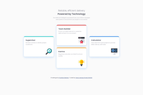
Four Card Feature Section Using HTML and CSS
Design comparison
Solution retrospective
Here, I make my projects using Flexbox. Any recommendations to improve my coding better are welcome :)
Community feedback
- @asbhogalPosted over 1 year ago
Hi Gora,
This is a good attempt however ideally you should be using grid as this retains the structure of the child container elements (ie. width values.) Between
500px
and985px
your containers subsequently compress down and change flow when they should keep their structure for this type of content.Kevin Powell has a good video explaining the differences and when to use one or the other YouTube link
Also, your images are missing
alt
tags - this is important for accessibility so screen readers and assistive technologies can identify the purpose and context of them. This article explains it in further detail ArticleHope this helps!
Marked as helpful0 - @matiasluduena23Posted over 1 year ago
Hi @goraindiraja! Good work! Just one advice, you
@media(min-width: 500px)
isn't working because you put the jump of screen in a very low size. Increase that number, @media(min-width: 700px) could work. Try different numbers.Good code!!!
0
Please log in to post a comment
Log in with GitHubJoin our Discord community
Join thousands of Frontend Mentor community members taking the challenges, sharing resources, helping each other, and chatting about all things front-end!
Join our Discord