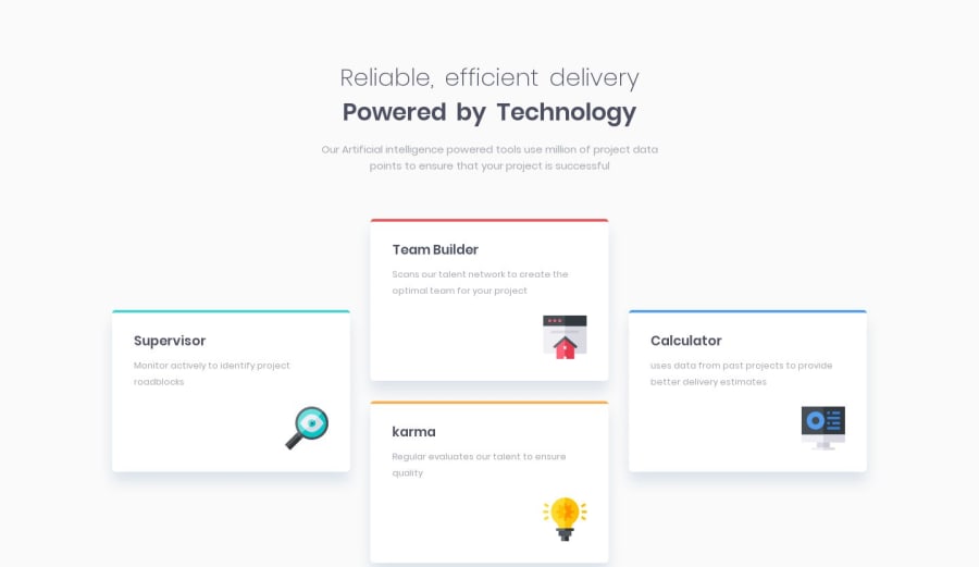
Design comparison
Solution retrospective
This is my first try on this Card design. I hope you like it.
Community feedback
- @ovidiuantonioPosted over 4 years ago
Hello, your solution is very nice! Good job! It's very responsive and it looks nice on most of the phones.
One small problem that you can easily fix is replacing the max-width: 375px media query width a 600px one, to make it look perfect for even bigger phones.
I like to use these breakpoints when I make a website:
- 1200px+ (large screens)
- 900px-1200px (tablet landscape)
- 600px-900px (tablet portrait)
- 0-600px (phones)
Happy coding! Keep going!
Marked as helpful3@awwmickyPosted over 4 years ago@ovidiuantonio, That is a useful tip, to have certain breakpoints! How to you setup your CSS & media query normally? Do you go from mobile to desktop or vice versa?
1@ovidiuantonioPosted over 4 years ago@awwmicky I like to do desktop first. When I finish the desktop version I resize the screen width (width dev tools mobile view) and I test for those breakpoints
2@sanixstudioPosted over 4 years ago@ovidiuantonio Thanks for your kind reply and those points to enhance the responsive design. I am definitely applying those changes.
1 - @awwmickyPosted over 4 years ago
I like the details you added, blue tints for each card's box-shadow!
1
Please log in to post a comment
Log in with GitHubJoin our Discord community
Join thousands of Frontend Mentor community members taking the challenges, sharing resources, helping each other, and chatting about all things front-end!
Join our Discord
