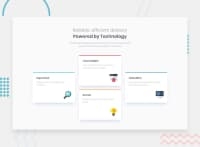
Design comparison
SolutionDesign
Community feedback
- @Bayoumi-devPosted over 2 years ago
Hey Shashwati,
My suggestions:
Document should have one main landmark, Contain the component with<main>.
<main>
   <div class="container">
      //...
   </div>
</main>
Heading levels should only increase by one, Useh2instead ofh3...Ordered headingsmake it easier to navigate and understand when using assistive technologies.- You need to work on the responsive web design
Resources ---> Learn responsive web design in 5 minutes, Responsive Web Design
Hope this is helpful to you... Keep coding👍
0@Shashwati09Posted over 2 years ago@Bayoumi-dev hey! Thanks for the review. I am yet to learn responsive web design as I'm not that good in CSS yet. Thank you for the resources too!
0@Bayoumi-devPosted over 2 years ago@Shashwati09 You are welcome😊
Marked as helpful0
Please log in to post a comment
Log in with GitHubJoin our Discord community
Join thousands of Frontend Mentor community members taking the challenges, sharing resources, helping each other, and chatting about all things front-end!
Join our Discord

