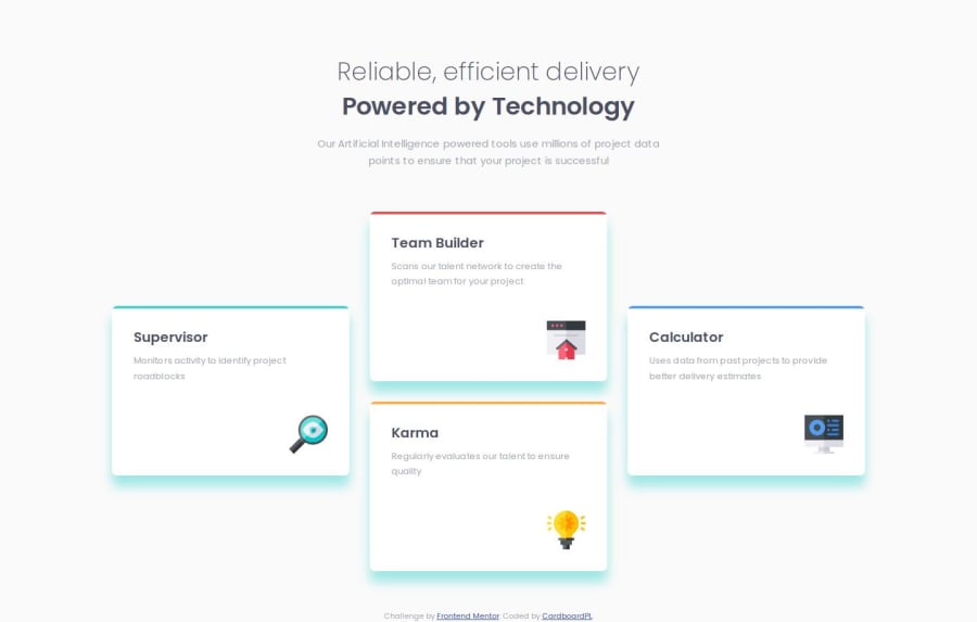
Design comparison
SolutionDesign
Solution retrospective
What are you most proud of, and what would you do differently next time?
I'm proud of the styling and how it was close to the design and I will probably use a better naming convention in the future.
What challenges did you encounter, and how did you overcome them?The layout of the feature items because I keep saying flexbox in my head but using flexbox to accomplish the design will ruin my semantic so I overcame it by using grid to accomplish the design.
What specific areas of your project would you like help with?Feedback on how to improve.
Community feedback
Please log in to post a comment
Log in with GitHubJoin our Discord community
Join thousands of Frontend Mentor community members taking the challenges, sharing resources, helping each other, and chatting about all things front-end!
Join our Discord
