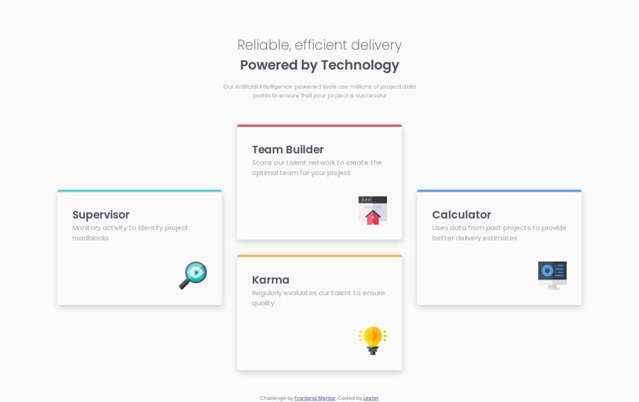
Design comparison
SolutionDesign
Solution retrospective
What are you most proud of, and what would you do differently next time?
I had an idea on how to replicate the layout even before starting to code just by using what I currently know. I'm quite proud of this because it shows just how much I improved.
What challenges did you encounter, and how did you overcome them?Trying to margin-top auto the icons and wondering why it wont work vertically, took a lot of time before I gave up and just flexed everything inside the card.
Another challenge was how to do the colored line, and I ended up searching it in YouTube. Turns out i have to make the thickness and the border radius the same to eliminate the down curves
What specific areas of your project would you like help with?feedback is welcome
Community feedback
Please log in to post a comment
Log in with GitHubJoin our Discord community
Join thousands of Frontend Mentor community members taking the challenges, sharing resources, helping each other, and chatting about all things front-end!
Join our Discord
