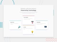
Design comparison
Solution retrospective
This is my first submitted solution. I have had a tough time with box shadows, and for anyone who has completed this challenge, kindly let me know where the 'Dark Blue' and 'Grayish Blue' color properties (as specified in the style guide' were used in the CSS? Also, I'd like to clarify, when monitoring the responsiveness of a page, is minimizing the desktop browser taken into consideration? Or is it just through the developer tools section (through the f12 option on Windows) where one can toggle between various viewports? Or are both considered? Other than that, feel free to point out where I did good and where I could have done better. I look forward to your feedback!
Community feedback
- @vanzasetiaPosted over 3 years ago
👋 Hi MacJay! My name is Vanza!
I have done this challenge and I would like to answer your questions:
- The
dark-bluecolor is used for.grid-item-1 h1and also on.card h3. - For
grayish-bluecolor is used for.grid-item-2 h2and also on.card p. - To toggle various viewport, you can check this Simulate mobile devices with Device Mode and scroll to Simulate a mobile viewport section. This website will explain how to toggle various viewport.
- As far as I know, if you zooming in or zoom out, the viewport width does not change at all, so my recommendation is to use the dev tool.
That's it! Hopefully this is answer all of your questions!
Marked as helpful2@Macjay27Posted over 3 years ago@vanzasetia Thanks a ton Vanza! Yes that answers my questions. Gracias
0 - The
- @palgrammingPosted over 3 years ago
I think the best way is just to drag the browser mobile size to desktop size while having the rulers turn on in the dev-tools.
You solution looks pretty good the only thing I thought was you might want to keep that 2 column 2 card layout a little longer so when it transitions the desktop cards will be a little bigger. Your cards look a little tall as you can see in the screen capture comparison so addressing that might help also
Marked as helpful0@Macjay27Posted over 3 years ago@palgramming Yes, the cards definitely do look taller than they ought to be. Thanks for the feedback Patrick! I appreciate it
0
Please log in to post a comment
Log in with GitHubJoin our Discord community
Join thousands of Frontend Mentor community members taking the challenges, sharing resources, helping each other, and chatting about all things front-end!
Join our Discord

