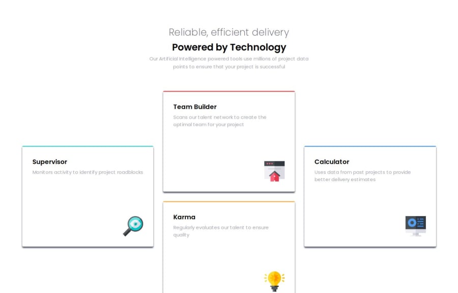


Design comparison

Solution retrospective
I was able to this design quick as I was practicing it from time to time. I have learned more about grid and flexbox properties from this challenge.
What challenges did you encounter, and how did you overcome them?I had challenge to fix the cards like in the design image for the desktop and mobile. I used grid method for the desktop and flexbox for the mobile screen. I found it easy to use both than using only one.
What specific areas of your project would you like help with?I could not figure out the shadows exactly like the design images. It was difficult for me as I have no much experience with figma. I want help with box shadows properties to make it look exactly like the design. Also, I have use max width and max height properties so that it does not exactly match with the design. The box looks bigger than the actual design. How do I fix it?
Community feedback
Please log in to post a comment
Log in with GitHub
Join our Discord community
Join thousands of Frontend Mentor community members taking the challenges, sharing resources, helping each other, and chatting about all things front-end!
Join our Discord