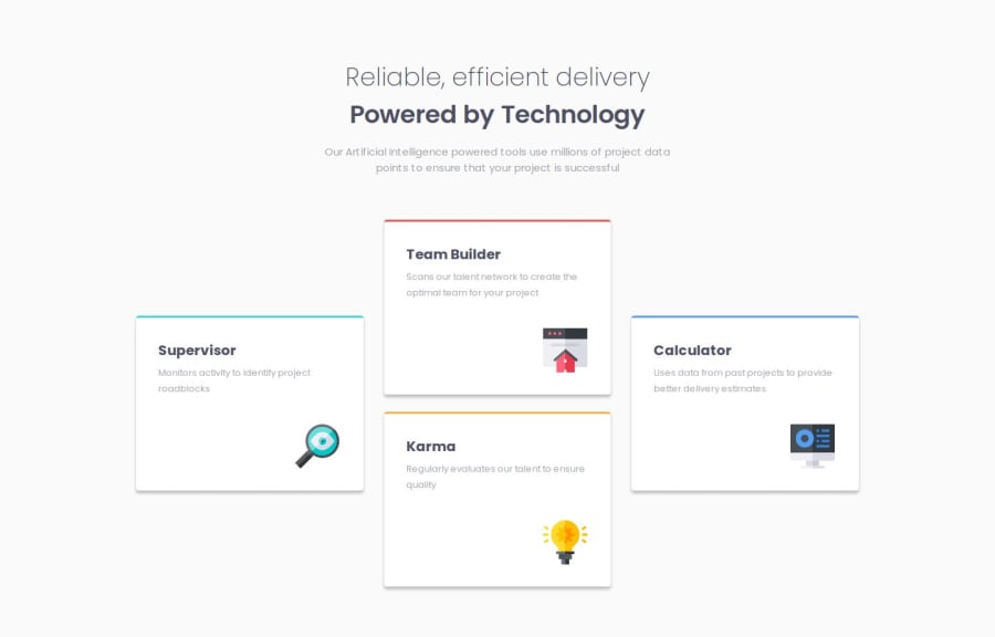
Design comparison
Solution retrospective
I used the grid for the first time and I am proud of learning this tool. I think that next time I will immediately write out the columns in Paint so that it will be easier for me to position specific cards.
What challenges did you encounter, and how did you overcome them?The challenge here was the grid but after reading some documentation I managed to achieve the target layout. I had a problem with vertically centering the 1st and last card but after writing out the entire grid in Paint it was easier.
What specific areas of your project would you like help with?I would like to ask you to check the code, its readability, aesthetics. And if there are things that can improve responsiveness or cause problems in the future.
Community feedback
- @Andymiguel25Posted 6 months ago
This is a good Job. Looks perfectly alike
1
Please log in to post a comment
Log in with GitHubJoin our Discord community
Join thousands of Frontend Mentor community members taking the challenges, sharing resources, helping each other, and chatting about all things front-end!
Join our Discord
