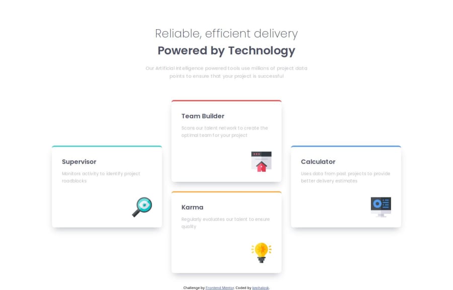
Four Card Feature Section using Flexbox


Design comparison

Solution retrospective
n/a
What challenges did you encounter, and how did you overcome them?Fine-Tuning the box-shadow by trying out different values. Ended up with: box-shadow: 0 12px 22px -8px rgb($color-grey, 0.8);
What specific areas of your project would you like help with?n/a
Community feedback
- P@ldgPosted about 2 months ago
Hi Kephalosk,
Nice work on this challenge, your Sass is so well organized I enjoy reading through it.
Your flexbox solution works really well on phones and desktop, however on tablets it doesn't seem to work as well. I notice you solve the layout problem on larger screens by wrapping the Team Builder and Karma cards in their own content container so they stack once the cards have enough space.
This works great on Desktop, however on tablets in portrait mode the layout seems to break. If you change
.content {
flex-wrap: nowrap;
}
That would fix the layout, but squish the size of the cards. So not a useful solution. I'm not sure how to resolve that with flexbox.
I'd suggest looking at Grid CSS for this kind of problem, you have greater control over the cards with Grid, so you wouldn't need to wrap those two cards to get them to stack.
Either way, solid work on this challenge.
Marked as helpful1P@kephaloskPosted about 2 months ago@ldg yeah, I noticed the strange tablet layout too. It looks a little bit wild. You're right. Grid would be a better way to go for scenarios like this. I played this Grid Garden Game that is mentioned on the learning Path here and feel more confident now to try Grid next time. Thanks for your feedback. Have a great day :)
0

Please log in to post a comment
Log in with GitHub
Join our Discord community
Join thousands of Frontend Mentor community members taking the challenges, sharing resources, helping each other, and chatting about all things front-end!
Join our Discord