Submitted over 1 year ago
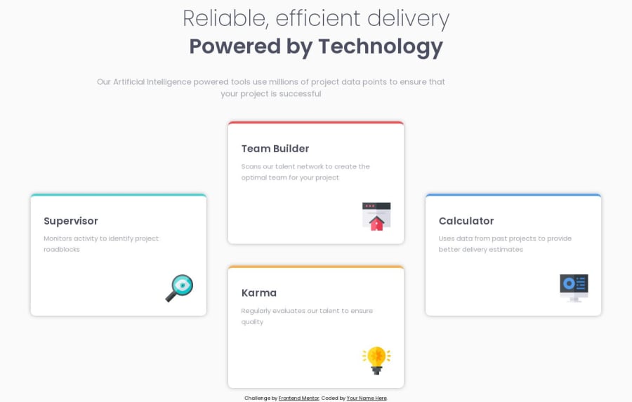
Four Card Feature Section Using Flexbox
#accessibility
@MonarchRyuzaki
Design comparison
SolutionDesign
Solution retrospective
Actually, The main Design was pretty simple. The challenge was in making the layout responsive for various screen sizes. Here I followed the usual way, the way I used to do things(i.e, Desktop First). This made me realize that a lot of code is repeated and is probably not the best way. From next challenge onwards, I will be using the mobile First Workflow, and maybe redo this later
Any advice about making responsive layouts(specifically) or any other advice apart from that is appreciated
Thank you
Community feedback
Please log in to post a comment
Log in with GitHubJoin our Discord community
Join thousands of Frontend Mentor community members taking the challenges, sharing resources, helping each other, and chatting about all things front-end!
Join our Discord
