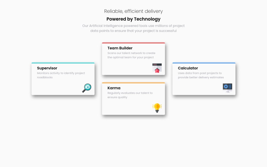
Design comparison
SolutionDesign
Solution retrospective
Any feedbacks are welcome, I have tried to do this the most responsive as posible.
Community feedback
- @AgataLiberskaPosted almost 3 years ago
Hi Rodrigo, this looks really nice! The one thing I'd change is instead of setting a width to the cards, set a max-width. It will still look the same on wider screens but will also help the content not overflow on smallest viewports :) You could also adjust the padding on the cards a little bit to make them match the design a bit better, but the layout was the biggest challenge here and you dealt with it really well.
Marked as helpful2@rodrigovnPosted almost 3 years ago@AgataLiberska thanks a lot, I will keep this in my notes for the next projects
0
Please log in to post a comment
Log in with GitHubJoin our Discord community
Join thousands of Frontend Mentor community members taking the challenges, sharing resources, helping each other, and chatting about all things front-end!
Join our Discord
