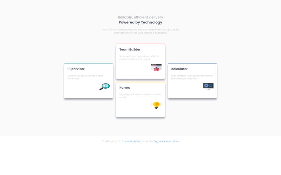
Four card feature section using flexbox
Design comparison
Solution retrospective
Hi everyone, This is my fourth layout challenge and I think I've mastered some layout skills. Peep my code and give me feedback on any improvement and best practices.
Community feedback
- @correlucasPosted about 2 years ago
👾Hello @ArthurKingDev, Congratulations on completing this challenge!
I saw your preview site and I liked a lot the work you’ve done here, it's almost complete, I’ve some suggestions you can consider applying to your code:
1.Add the website favicon inserting the svg image inside the
<head>.<link rel="icon" type="image/x-icon" href="./images/favicon-32x32.png">2.The box-shadow is a bit too strong, this is due the
opacityandblur. The secret to create a perfect and smooth shadow is to have low values foropacityand increaseblurtry this value instead:box-shadow: 12px 7px 20px 6px rgb(57 75 84 / 8%);If you’re not familiar to box-shadow you can use this site to create the shadow design and then just drop the code into the CSS: https://html-css-js.com/css/generator/box-shadow/
✌️ I hope this helps you and happy coding!
Marked as helpful0
Please log in to post a comment
Log in with GitHubJoin our Discord community
Join thousands of Frontend Mentor community members taking the challenges, sharing resources, helping each other, and chatting about all things front-end!
Join our Discord
