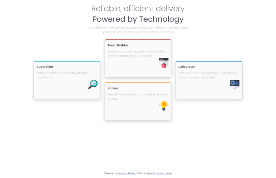
Four card feature section using CSS, HTML and Bootstrap
Design comparison
Solution retrospective
What do you guys think about the responsiveness? What do you think about the visual aspect of the page? does it look good? What are some practices that you think can be improved?
Community feedback
- @VCaramesPosted about 2 years ago
Hey there! 👋 Here are some suggestions to help improve your code:
- To center you content to your page, add the following to your Body Element:
body { min-height: 100vh; display: grid; place-content: center; }-
The “Reliable, efficient delivery Powered by Technology” is one single heading so the entire thing should be wrapped in a single <h1> Heading along with a Span Element.
-
The icons serve no other purpose than to be decorative; They add no value. There Alt Tag should left blank and have an aria-hidden=“true” to hides it from assistive technology.
-
To give your HTML code structure, you want to set up your code in the following manner:
<body>
   <header></header>
   <main>
      <section>
            <div class="supervisor-card"></div>
            <div class="team-card"></div>
            <div class="karma-card"></div>
            <div class="calculator-card"></div>
      </section>
   </main>
</body>
The Header Element represents the your site’s introductory content.
The Main Element identifies the main content of your content..
The Section Element is used to wrap content that is related to each other, which these four cards are.
Lastly, since none of the cards can stand on their own, a simple Div will do for each card.
If you have any questions or need further clarification, let me know.
Happy Coding! 👻🎃
Marked as helpful0@RicardoFuentes437Posted about 2 years ago@vcarames Thank you so much for your feedback, i'll keep all of this in mind when i work on the next challenge :)
0
Please log in to post a comment
Log in with GitHubJoin our Discord community
Join thousands of Frontend Mentor community members taking the challenges, sharing resources, helping each other, and chatting about all things front-end!
Join our Discord
