Design comparison
Solution retrospective
It was my first time using CSS grid and I'm glad it went easy.
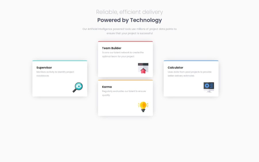
What challenges did you encounter, and how did you overcome them?I found it difficult aligning the cards at the center of the column in desktop design but after few trials I was able to solve it using align-self: center; on the child element.
While checking the compatibility with various screens, I noticed the desktop design on some large screen are not properly aligned and despite several attempt to fix this issue, I couldn't come up with a solution that doesn't involve changing the display from grid to flex.
Community feedback
- @mkborisPosted 8 months ago
Hi Anthony, great job, to get it properly aligned on large screens add
place-content: center;on your .grid-container.Also, some suggestions
- All content should be wrapped within landmarks. Wrap a
maintag around your content. - You should have only one
H1per page.
Marked as helpful1 - All content should be wrapped within landmarks. Wrap a
Please log in to post a comment
Log in with GitHubJoin our Discord community
Join thousands of Frontend Mentor community members taking the challenges, sharing resources, helping each other, and chatting about all things front-end!
Join our Discord
