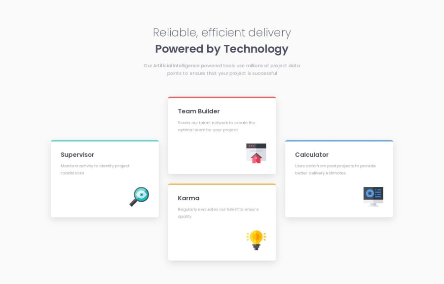
Four card feature section using CSS grid


Design comparison

Solution retrospective
Using CSS grid to align the cards as per the design on larger screen-size.
What challenges did you encounter, and how did you overcome them?-
For cards at first I used media-queries to give it a height of 250px on larger screen-size, but I was able to use CSS grid on the div(.card__grid) wrapped around cards, and adjust the height using grid-template-rows.
-
I was able to align icons (.card__img) as per the design by applying CSS Grid on the card (.card).
-
I couldn't adjust the icon size (.card__img) without using media-queries. I tried using width (89.07% ) and max-width (64px), then I also tried applying min-width (57px) with either width (100%) or max-width (64px). Can someone please help understand why it might not have worked and how could i solve this?
-
Could someone please explain why when I reduce the margin between two cards, the size of the cards reduces as well?
Community feedback
Please log in to post a comment
Log in with GitHub
Join our Discord community
Join thousands of Frontend Mentor community members taking the challenges, sharing resources, helping each other, and chatting about all things front-end!
Join our Discord