Design comparison
SolutionDesign
Solution retrospective
What are you most proud of, and what would you do differently next time?
Tell me if i did something wrong,any feedback is welcome, tks you so much ^^!
Community feedback
- @jakegodsallPosted 8 months ago
Hi 👋
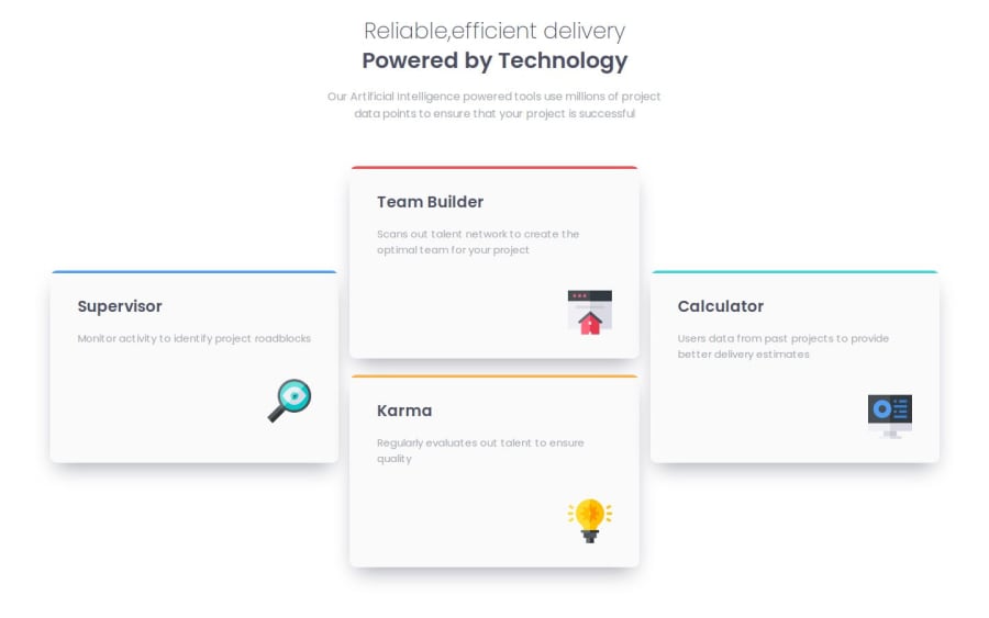
Well done with this. It looks really good in both mobile and desktop viewports! However, with very large viewports the three columns become very spread out. I would recommend adding a fixed-value
max-widthto the<main>element that wraps the entire layout. That way you won't have this spread..main { max-width: 1600px; }Hope this helps 😁
Marked as helpful1
Please log in to post a comment
Log in with GitHubJoin our Discord community
Join thousands of Frontend Mentor community members taking the challenges, sharing resources, helping each other, and chatting about all things front-end!
Join our Discord
