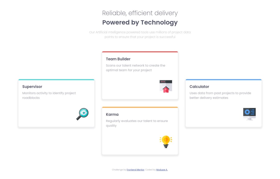
Design comparison
Solution retrospective
This is my second attempt at coding this project. The first one was without CSS Grid and Flexbox (which I didn't know how to use at that time). After learning CSS Grid and Flexbox, I applied it this time. Constructive criticism welcome!!
Community feedback
- @MarlonPassos-gitPosted over 3 years ago
- In the HTML in the header part I found it very confusing because you use two
<h1>tags and then a<h4>that's not cool, always use the h tags where h1, h2, h3 ... I would use the header like this
<header class="header">
   <h1 class="header__title"> Reliable, efficient delivery<br>
   <strong class="header__title--strong">Powered by Technology</strong>
   </h1>
  <p class="header__description">
   Our Artificial Intelligence powered tools use millions of project data points
to ensure that your project is successful
   </p>
</header>
easier to understand
- cards go from 1 column to 3 columns only at 1250px wide, it would be nice if in the meantime you fit the cards with 2 columns as well and maybe even the width of the cards a little flexible
Marked as helpful0@Modu9173Posted over 3 years ago@MarlonPassos-git Thank you so much Marlon. I was trying to figure a way to code both titles without using two h1s, but when I tried coding the second head-title as h2 the display was different so I researched and found this article
https://www.greenlanemarketing.com/resources/articles/seo-101-seo-and-multiple-h1-tags/
So I must have misunderstood. But Thank you.
I'll try adding the two columns and if I may ask could you explain further making the width of the cards a little flexible? Thanks
0@MarlonPassos-gitPosted over 3 years ago@Modu9173 I think in the article they talk about the use of several <h1> in a page in a context that these H1s will be inside <section> and <artigle> tags, mainly artigle because it is a content tag independent of the page"
in my case I used the grid tremplate area 1 column: grid-template: { "card1" "card2" "card3" "card4" }
2 columns: grid-template: { "card1 card2" "card3 card4" }
3 columns: grid-template: {` "card1 card2 card4" "card1 card3 card4"' }
In this case I used @media to apply each format to a certain screen width
I strongly recommend you to read this full article on css grid https://css-tricks.com/snippets/css/complete-guide-grid/
0 - In the HTML in the header part I found it very confusing because you use two
- @palgrammingPosted over 3 years ago
well with Grid-Template-Areas you can rearrange the cards so easy you might want to think about creating a middle transition between the mobile and desktop layout of 2 columns with two cards so you do not end up with so much white space around your cards are you can see when the browser is 1200px wide
Marked as helpful0@Modu9173Posted over 3 years ago@palgramming Thank you Patrick! I'll try it out. And with the grid-template-areas, please could you show me a sample code... I'm still trying to grasp CSS Grid and Flexbox.
0@palgrammingPosted over 3 years ago@Modu9173 this should help https://www.smashingmagazine.com/understanding-css-grid-template-areas/
0
Please log in to post a comment
Log in with GitHubJoin our Discord community
Join thousands of Frontend Mentor community members taking the challenges, sharing resources, helping each other, and chatting about all things front-end!
Join our Discord
