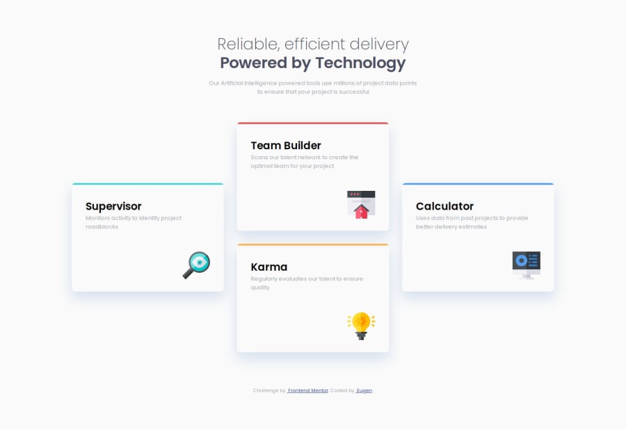


Design comparison

Solution retrospective
I've practiced a bit the CSS grid to get the desired layout, even if I started with Flexbox and some additional divs in HTML, I considered that nesting similar elements is not the best approach for a responsive layout.
Again I've used SASS just to practice it, as it could work with plain CSS also
What challenges did you encounter, and how did you overcome them?I should practice more different ways to get a responsive design without media queries
What specific areas of your project would you like help with?I'm sure the css is not the optimized enough, as I might not used all the benefits provided by SASS. Some tips about this would help. Thanks
Community feedback
- @sksksk2024Posted 9 months ago
Unlike me, you paid attention to style h1 for desktop. I found it easier to make phone first, and then desktop(just as an advice ;-) ). Overall, your project looks pretty impressive. Keep on coding!! 🔥🔥🔥
1

Please log in to post a comment
Log in with GitHub
Join our Discord community
Join thousands of Frontend Mentor community members taking the challenges, sharing resources, helping each other, and chatting about all things front-end!
Join our Discord