Submitted 2 months ago
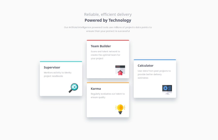
Four card feature section using CSS Grid
#sass/scss#bem

@dimahodanit

Design comparison
SolutionDesign

Solution retrospective
What are you most proud of, and what would you do differently next time?
I had to think carefully about the desktop version, and also in this project I combined flex and grid approaches
What challenges did you encounter, and how did you overcome them?for some reason I thought for a long time about how to build a grid for the desktop version, so that there were two cards in the middle. I had to look at the solution from another challenge participant
What specific areas of your project would you like help with?I would like to know more about units of measurement and which ones are best to use for adaptive layout
Community feedback
- P@jstrzyzykowskiPosted 2 months ago
Good job!
Clean HTML structure.
You can check:
- block/inline approach regarding modern CSS
- helpers like repeat, min, minmax for Grid
Keep going!
Marked as helpful0

Please log in to post a comment
Log in with GitHubJoin our Discord community
Join thousands of Frontend Mentor community members taking the challenges, sharing resources, helping each other, and chatting about all things front-end!
Join our Discord