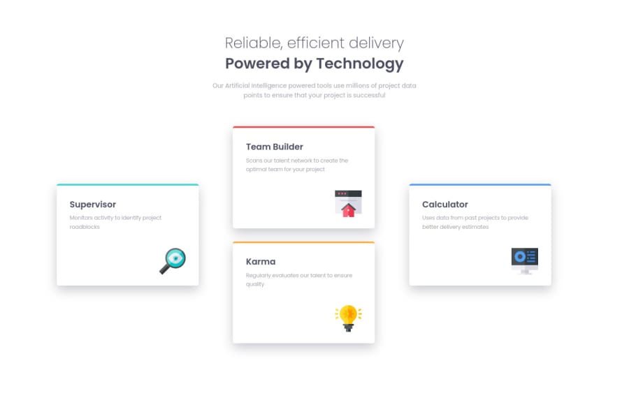
Design comparison
Solution retrospective
When I was using Firefox and Chrome "Responsive design mode" I do not get the accurate device width. It was slightly larger than the actual pixel width I set. So is there any method or workaround to get accurate screen size?
Community feedback
- P@kens-visualsPosted over 3 years ago
Hey @chaman-rawat 👋🏻
I've got some feedback for the project.
- For the icons, add
aria-hidden="true”, because they're for decoration. You can read more aboutaria-hiddenhere. For example:
<img src="images/icon-team-builder.svg" alt="Team Builder">- Avoid, positioning items with just
margins especially when you're trying to center them. Both Flexbox and Grid have things likealign-items,justify-content, etc. you should use them for positioning. - Also, avoid fixed units for layouts such as pixels, try to use rems and percentages for things like
width. - Lastly, to answer your question, there's no way to get accurate screen size from browser DevTools, because sometimes in DevTools things look superb for mobile viewport width, but when you open it on an actual phone some things may not look or work as excepted, but that's pretty rare nowadays.
I hope this was helpful 👨🏻💻 other than that, for the first project you did a great job, well done. Cheers 👾
Marked as helpful2 - For the icons, add
Please log in to post a comment
Log in with GitHubJoin our Discord community
Join thousands of Frontend Mentor community members taking the challenges, sharing resources, helping each other, and chatting about all things front-end!
Join our Discord
