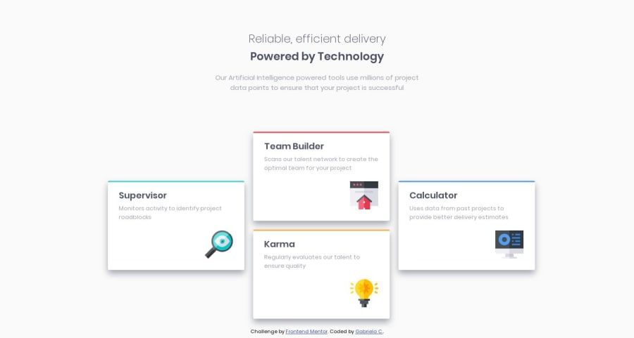
Four card feature section using CSS flexbox and grid
Design comparison
Solution retrospective
-
Was my usage of Flexbox for the mobile version and Grid for the desktop correct? Should only one be used for both?
-
Are there any ways I could have made my code more reusable or readable?
-
Any kind of feedback is welcome!
Community feedback
- @Richard-08Posted over 4 years ago
Hi, Gabriela! Good work!
The answer to your first question: For # four-card section, you can use the "flex-wrap: wrap;". Then the blocks will be transferred and you can not use grid in the media queries.
Good luck, Gabriela!
2@gcardenasdevPosted over 4 years ago@Richard-08 Hi Richard! Thank you for the feedback! I decided to use grid for both mobile and desktop, I haven't quite figured out Flexbox yet but I'll definitely keep studying it and trying to implement it in future projects!
1 - @carrillodevPosted over 4 years ago
Be careful with h1, they have a lot of power on SEO, when we have two or more h1 they lose a lot of power.
1@gcardenasdevPosted over 4 years ago@carrillof I condensed it to one H1 and used to style the second half. Thank you so much for your feedback!
0
Please log in to post a comment
Log in with GitHubJoin our Discord community
Join thousands of Frontend Mentor community members taking the challenges, sharing resources, helping each other, and chatting about all things front-end!
Join our Discord
