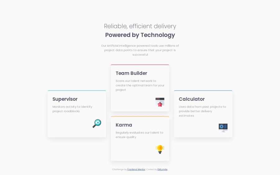
Design comparison
Solution retrospective
I really enjoyed using the CSS Grid to complete this challenge, I learned a lot from it. Next time I will try to do it using flexbox. Oh, I had fun making a tablet version of the page I hope you will see it 😊
What challenges did you encounter, and how did you overcome them?The layout of the cards on desktop confused me a little at first but I quickly knew what to do, I first used the flexbox but I didn't like the result so I opted for the CSS Grid
Community feedback
- @Abdallh-hatamlehPosted 10 months ago
Great job I was struggling with how the drop shadows are done but yours looks quite good.
0
Please log in to post a comment
Log in with GitHubJoin our Discord community
Join thousands of Frontend Mentor community members taking the challenges, sharing resources, helping each other, and chatting about all things front-end!
Join our Discord
