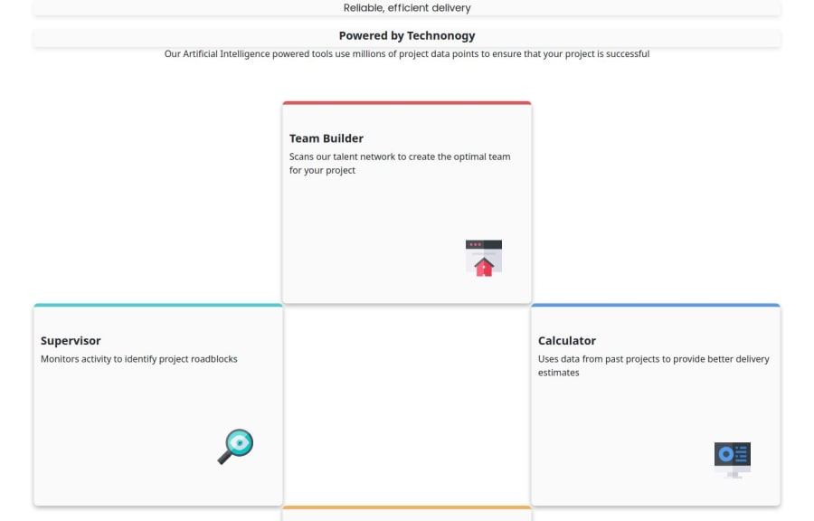
Four card feature section Uisng Boot streap,HTML,CSS
Design comparison
Solution retrospective
I’m proud of completing this complex task. Next time, I’ll focus on making it more responsive and try to ensuring the design requirements are fully met.
What challenges did you encounter, and how did you overcome them?I faced some challenges with making the layout responsive and managing spacing issues.
What specific areas of your project would you like help with?I would be happy to receive suggestions on how to simplify my code and write it more concisely. I’m also interested in learning how to make my design more responsive and improve my skills in web development. Additionally, any tips on using Bootstrap efficiently would be greatly appreciated.
Community feedback
- @geomydasPosted about 2 months ago
I don't reccomend learning Bootstrap at this stage. Your fundamentals are still too messy and Bootstrap will only hinder the process
Marked as helpful0@kak23333Posted about 2 months agoI am using Bootstrap for responsiveness. If you don't recommend it, what should I use for responsiveness? And why shouldn't I use Bootstrap? Thanks.
0@geomydasPosted about 2 months ago@kak23333 bootstrap is ok but i dont reccomend using it since your code has still a lot of bad practicies and you should focus on the fundamentals before jumping into a framework. i dont get what you mean with responsiveness since you can do that with any css framework. ive had experiences before where i had to remove bootstrap in some codebases
0@kak23333Posted about 2 months agoResponsive means the page/website should be friendly to all devices. I am a beginner and I am learning Bootstrap basics. Try to change its code according to yourself. Can you recommend which framework I should use instead of Bootstrap as a beginner and Why?
0@geomydasPosted about 2 months ago@kak23333 i don't reccomend using a framework at this phase. your css has a lot of issues and using a framework will only hinder your learning. stick with plain css for now
0@kak23333Posted about 2 months agook I understrad but when i should leran it.How to make respossive
0@geomydasPosted about 2 months ago@kak23333 i reccomend checking out kevin powells course about responsive design. you would learn a framework when you are very confident and good with vanilla csss
Marked as helpful0 - @SvitlanaSuslenkovaPosted about 2 months ago
Hi. This project is easier to do using grid, flex css will be more complicated in this situation. You need to add grid to div container, grid should have 3 columns and 2 rows. You can span 2 rows for side cards and align them to the center.
Hope you found this comment helpful :)
0 - @StroudyPosted about 2 months ago
For a task like this its best to use CSS Grid, I recommend watching some YouTube videos about grid but you’re making fantastic progress. Here are some small tweaks that might take your solution to the next level…
-
Adding a
<title>
to your header, -
Having a clear and descriptive
alt
text for images is important because it helps people who use screen readers understand the content, making your site more accessible. It also improves SEO, as search engines usealt
text to understand the image's context, helping your site rank better, Check this out Write helpful Alt Text to describe images, -
Developers should avoid using pixels (
px
) because they are a fixed size and don't scale well on different devices. Instead, userem
orem
, which are relative units that adjust based on user settings, making your design more flexible, responsive, and accessible. For more information check out this, Why font-size must NEVER be in pixels or this video by Kevin Powell CSS em and rem explained.- Another great resource for px to rem converter. -
Using
rem
orem
units in@media
queries is better thanpx
because they are relative units that adapt to user settings, like their preferred font size. This makes your design more responsive and accessible, ensuring it looks good on different devices and respects user preferences. -
Using a naming convention like BEM (Block, Element, Modifier) is beneficial because it makes your CSS more organized, readable, and easier to maintain. BEM helps you clearly understand the purpose of each class, avoid naming conflicts, and create reusable components, leading to a more scalable codebase. For more details BEM,
-
Using
max-width: 100%
ormin-width: 100%
is more responsive than justwidth: 100%
because they allow elements to adjust better to different screen sizes. To learn more, check out this article: responsive-meaning.
Great job taking the time to learn! Your efforts are paying off, and I hope these insights guide you to even more success. Keep pushing forward, and remember, you’ve got this! Enjoy your coding adventures! 💪
0 -
Please log in to post a comment
Log in with GitHubJoin our Discord community
Join thousands of Frontend Mentor community members taking the challenges, sharing resources, helping each other, and chatting about all things front-end!
Join our Discord