Submitted 6 months ago
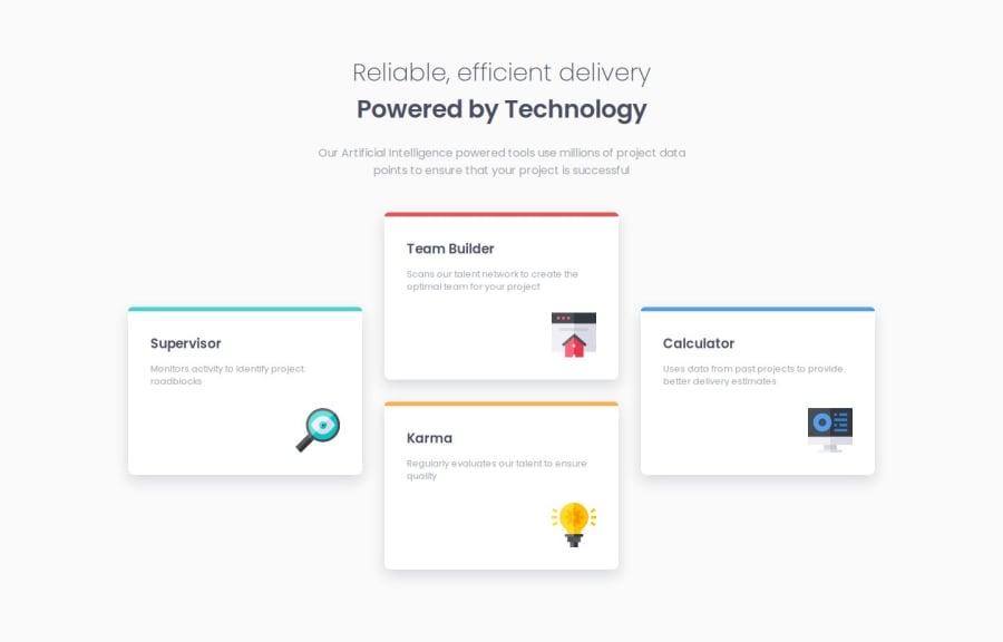
Four Card Feature Section solution using CSS Grid & Flexbox
@b16h22
Design comparison
SolutionDesign
Solution retrospective
What challenges did you encounter, and how did you overcome them?
Placing the cards in the unique layout as seen in the design brief was a challenge. Initially I tried to achieve the result with CSS Flexbox. I was able to make it work but with a lot of hacks. Then I came across CSS Grid layout and it was the much easier and cleaner solution with less code to achieve the same result. It was easier to create a responsive layout with Grid.
Join our Discord community
Join thousands of Frontend Mentor community members taking the challenges, sharing resources, helping each other, and chatting about all things front-end!
Join our Discord
