Design comparison
SolutionDesign
Solution retrospective
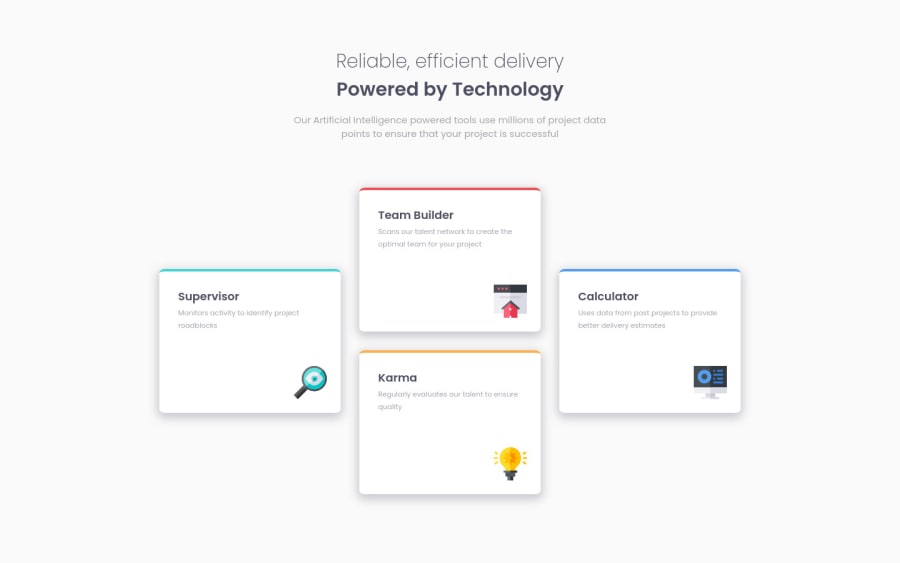
Aligning cards on desktop version was pain but I think I managed well. Maybe I cheated with entering exact pixel values for card height and widths but I had to.
I also made border top colors and images with variables from html to css. Wrote a javascript code incase anyone would want to do that way. If you want to do with the javascript code i made all you have to do is add data-border: (color-value-you-want) to sections and add another code for background images.
In overall, this was a little hard to align but educational.
Community feedback
Please log in to post a comment
Log in with GitHubJoin our Discord community
Join thousands of Frontend Mentor community members taking the challenges, sharing resources, helping each other, and chatting about all things front-end!
Join our Discord
