Four Card Feature Section Solution

Solution retrospective
I'm proud to have successfully created a grid layout, especially the way it looks in the desktop version. If I were to do it again, I would focus more on planning the layout in advance to reduce the number of mistakes and simplify the process.
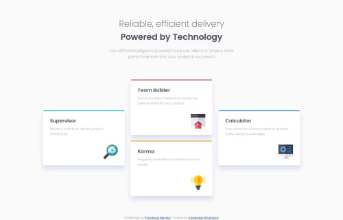
What challenges did you encounter, and how did you overcome them?The grid layout for the desktop design was a significant challenge. It took some experimentation to balance the placement of the cards while maintaining a clean and cohesive look. For example, one card takes up the first column, two cards the second, and the last card the third, all with the same height and width to give them a finished look. To refine the layout, I used a CSS grid generator, which made it easier to visualise and test different settings.
What specific areas of your project would you like help with?I would like to explore the use of SCSS to manage complex grid layouts and learn about alternative approaches to improve responsiveness and scalability.
Please log in to post a comment
Log in with GitHubCommunity feedback
No feedback yet. Be the first to give feedback on vladyslav-shulhach's solution.
Join our Discord community
Join thousands of Frontend Mentor community members taking the challenges, sharing resources, helping each other, and chatting about all things front-end!
Join our Discord