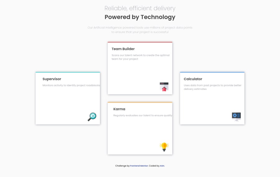
Design comparison
Solution retrospective
I think I did a good job in here :)
Community feedback
- @correlucasPosted over 2 years ago
👾Hello again ASH, congratulations for your new solution!
Great solution here! You've built an amazing html structure with semantic tags. I've two tips for you:
Your shadow is too much dark and strong, to create a smooth shadow you need to give it less
opacityand moreblurhere’s a good value for this shadowbox-shadow: 5px 5px 15px 5px rgb(0 0 0 / 5%);A great way to design and learn about shadows is creating them in this site and see the code output: https://www.cssmatic.com/box-shadow
To improve the cards you can add
border-radius: 14pxto have a smooth a rounded borders. This gives the card a special design.👋 I hope this helps you and happy coding!
Marked as helpful1
Please log in to post a comment
Log in with GitHubJoin our Discord community
Join thousands of Frontend Mentor community members taking the challenges, sharing resources, helping each other, and chatting about all things front-end!
Join our Discord
