Not Found
Not Found
Not Found
Not Found
Not Found
Not Found
Not Found
Not Found
Not Found
Not Found
Not Found
Not Found
Not Found
Not Found
Not Found
Not Found
Not Found
Not Found
Not Found
Not Found

Submitted

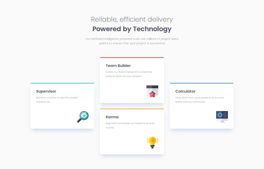
Four Card Feature Section Solution [HTML + CSS, Grid]

@faruqAbdulHakim

Desktop design screenshot for the Four card feature section coding challenge

This is a solution for...

  • HTML
  • CSS
1newbie
View challenge

Design comparison


SolutionDesign

Solution retrospective


Feel free to give your feedback or suggestions to this solution. šŸ‘Œ

Community feedback

Daniel šŸ›øā€¢ 44,230

@danielmrz-dev

Posted

Hello there! šŸ™‹šŸ½ā€ā™‚ļø

Your solution looks excellent!

I have a suggestion about your code that might interest you:

šŸ“Œ If you don't have the Figma design files, I recommend using a browser extension called Perfect Pixel.

It allows you to compare your finished project with the design images that come along when you download the project and check the (almost exact) dimensions. It's very useful!

I hope it helps you in future projects! šŸ˜Š

Other than that, great job!

Marked as helpful

1

@faruqAbdulHakim

Posted

@danielmrz-dev Hi Daniel, thanks for your suggestion. Yeah, I already installed the Perfect Pixel extension before, and I agree with you it's really helpful. Hope your suggestion also reach other developer here. šŸ˜€

1
Petrit Nurediniā€¢ 2,860

@petritnuredini

Posted

Congratulations on completing the Four Card Feature Section project! It's fantastic to see your hard work and dedication paying off. Here are a few suggestions to further enhance your project:

  1. Consistent Font Sizing:

    • Your header uses multiple font sizes (36px and 15px). It's good practice to maintain a consistent font size hierarchy for better readability. Consider adjusting the font size of the first paragraph in the header to make it slightly smaller than the main heading. This will help create a clear visual hierarchy on the page. Check out this guide on typographic hierarchy.
  2. Responsive Design:

    • You've done well with media queries, but there's room for improvement. As the screen width reduces, the content in the cards might feel cramped. Consider increasing the padding inside the cards for smaller screens to ensure the content has enough breathing space. Here's a useful resource on responsive design.
  3. Accessibility and Semantic HTML:

    • Your use of semantic HTML is good, but ensure that all interactive elements are accessible. For example, if you plan to make the cards clickable, use <a> tags or <button> with appropriate ARIA roles. This ensures that the site is navigable and accessible to all users, including those using screen readers. Learn more about accessibility at Web Accessibility Initiative (WAI).

Keep up the fantastic work! Remember, every project you complete brings you one step closer to mastering web development. Your progress is commendable, and I'm excited to see what you create next. Keep pushing your boundaries and happy coding! šŸš€šŸ’»

0

Please log in to post a comment

Log in with GitHub
Discord logo

Join our Discord community

Join thousands of Frontend Mentor community members taking the challenges, sharing resources, helping each other, and chatting about all things front-end!

Join our Discord