Design comparison
Community feedback
- @psdesignroPosted 9 months ago
Hi!
It looks good, nice job!
I have noticed some aspects you can improve still:
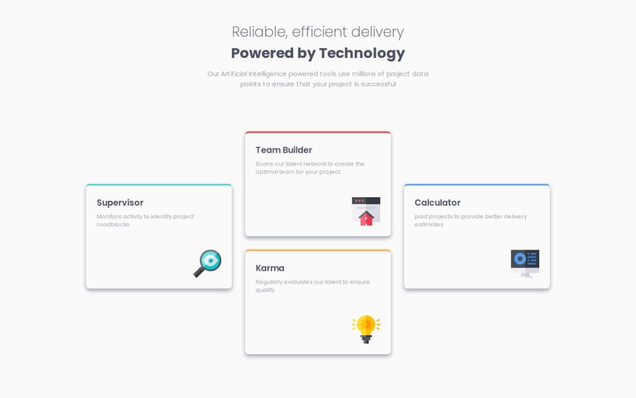
At first glance, the text weight for the bold heading is a bit different. Also the colored stripe at the top of the cards has a little trick. If you zoom in the design, you'll notice that it is curved only on top and straight at the bottom. You can achieve this by adding and empty div with 4px height, and set overflow:hidden on parent. You can check my code for details.
Also, for the desktop version, I recommend using grid instead of flex with wrap, because on large screens (for example on my 24inch monitor) all the cards are aligned in a row, as the flex container has more room and they don't wrap.
Keep up the good work!
Marked as helpful0
Please log in to post a comment
Log in with GitHubJoin our Discord community
Join thousands of Frontend Mentor community members taking the challenges, sharing resources, helping each other, and chatting about all things front-end!
Join our Discord
