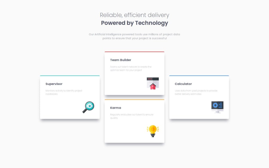
Design comparison
Solution retrospective
This project was build using only base HTML and CSS without the use of frameworks or preprocessors. I'm most proud of my improvements with being able to break down the given design into the elements needed to build it and my speed in writing the necessary code. As for what I would do differently next time, I know my code could be cleaner and organized better, and there are most likely better ways to have accomplished the goals for this challenge. Any feedback that can be given would be greatly appreciated to help toward that.
What challenges did you encounter, and how did you overcome them?I'm still getting a handle on responsive design and ensuring the project works across as many viewport sizes as possible. My main challenge had been with setting proper breakpoints to transition from one design to the next. In that area, tools like Firefox responsive design mode has enabled me to quickly test with a variety of viewports and make tweaks where needed.
What specific areas of your project would you like help with?There are two areas I'm most interested in feedback on with this project. The first is with my CSS code. Are there any ways to better organize and clean-up my CSS code to make it more clear and understandable for others? The second is regarding the layout. I used flex to lay out the card elements, and, while that worked, I'm wondering if there may have been a cleaner way to implement flex to accomplish the same goal. Mostly if there was a way to simplify my CSS code and achieve the same effect.
Community feedback
Please log in to post a comment
Log in with GitHubJoin our Discord community
Join thousands of Frontend Mentor community members taking the challenges, sharing resources, helping each other, and chatting about all things front-end!
Join our Discord
