Design comparison
Community feedback
- P@newspaceracerPosted 5 months ago
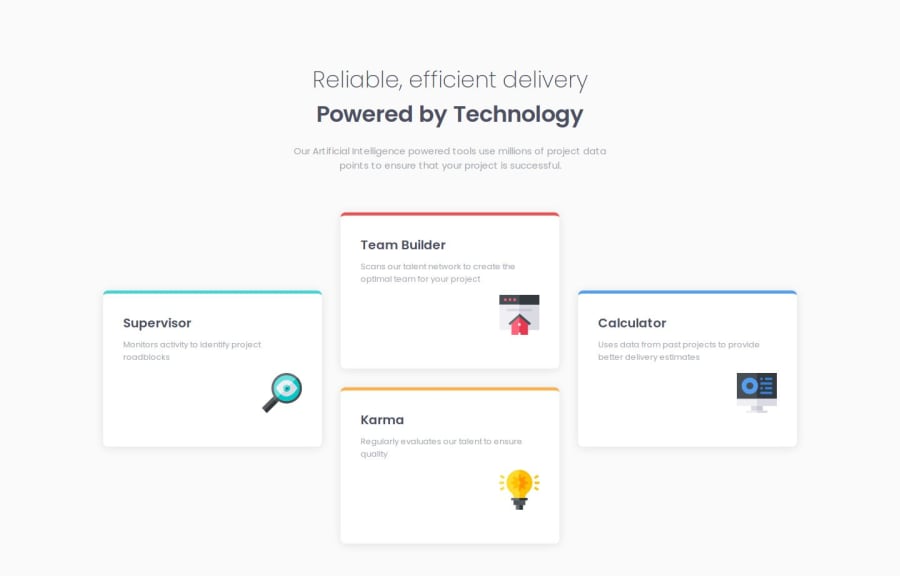
Nice approach! I liked that you kept it simple and used TransfromY to move the side cards down. The only thing I'd say is because you did the media queries there is a tiny point of like 20 pixels where the cards don't look like a + and look more like a T. I think this happened because the flex translate is not being encompassed by that media query so it should be an easy fix making the max-width smaller so that it doesn't remove the Y transform before it should.
Marked as helpful0
Please log in to post a comment
Log in with GitHubJoin our Discord community
Join thousands of Frontend Mentor community members taking the challenges, sharing resources, helping each other, and chatting about all things front-end!
Join our Discord
