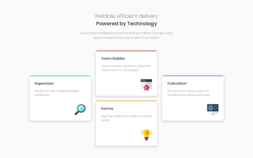
Four card feature section solution

Solution retrospective
This challenge took longer than expected but It feels good I was able to complete it. I decided on some implementation which I think is not the best approach to my challenges, but It work😂. I'll probably do it better once I figure out a better design approach.
What challenges did you encounter, and how did you overcome them?My biggest challenge during this project was placing the content card/box in the correct position. I didn't immediately think the CSS grid was the solution, so it took me longer trying to figure out how to position the boxes. I just started learning Grid actually and I guess I didn't understand I could use Grid in such a manner. I stumbled upon a similar design and inspected the code and saw what they did, so I just copied their code to Codepen and played with it, it seems easy but I still feel I don't understand it enough but hey, it worked😂. I also had a hard time getting the title description displayed correctly. I had to set a min-max for the description to get the result I wanted but I'm not sure if that was the correct solution but again it worked 😁.
What specific areas of your project would you like help with?I would love to get more clarity on the CSS grid. While ChatGPT and Claude Ai have been helpful, I think getting a professional to help me understand the concept would help me improve my skills a lot.
Please log in to post a comment
Log in with GitHubCommunity feedback
No feedback yet. Be the first to give feedback on adewalemudasiru's solution.
Join our Discord community
Join thousands of Frontend Mentor community members taking the challenges, sharing resources, helping each other, and chatting about all things front-end!
Join our Discord