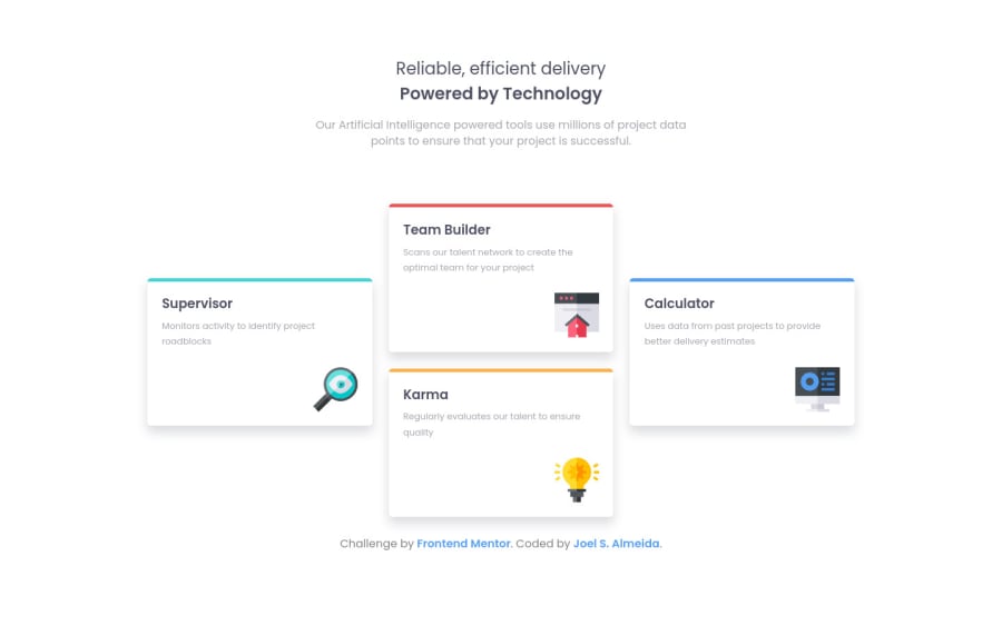
Design comparison
Solution retrospective
Despite being a small project, in this my first Frontend Mentor challenge I tried to use as many of the tools and concepts I learned in CSS, HTML, and Sass as possible. "Semantic markup, grid, variables, mixins with arguments, etc."
I tried naming my classes following BEM naming convention."But honestly... I don't know if I did it right"
This was also my first experience using Git and Github, so... Please, if you have tips on how I can improve my future projects, leave a comment.
Community feedback
- @grace-snowPosted over 3 years ago
Hi Joel
This looks really good for a first project. I'll list some learning points for you, but it definitely looks like you're on the right track with your learning ☺
- heading should be one heading. You can't have 2 h2s directly next to each other, as the first h2 is then not a heading for any content
- you don't need to use figure around images unless they are the kind that need a caption
- you're definitely not using BEM in naming conventions at the moment. It should be Block__element--modifier. Read up more about it if it's something you want to use
- in css definitely don't position absolute the body. A general rule is to only add properties that are needed.
- similarly, I don't think you need widths or heights on the grid or cards. Just a max-width on the grid would do I think.
I hope this helps you, good luck
Marked as helpful2@joelsalmeidaPosted over 3 years ago@grace-snow You are awesome. Excellent comment!
-
Really, only the first
<h2>
makes sense in this case. "it's the same content as a small part of the site" -
"The
<picture>
HTML element contains zero or more<source>
elements and one<img>
element to offer alternative versions of an image for different display/device scenarios." MDN Web Docs.
That's quite nice! Also, I was thinking about solutions for multiple images on responsive sites... Here we go!
- About
position: absolute
in the body, I used it to try to center the content regardless of screen resolution.
Centering objects inside a div is simpler, but I always have difficulty centering the first div on the body.
Do you have any tips on how I could solve this without needing to mess with the body?
0@grace-snowPosted over 3 years ago@joelsalmeida in real sites It's rare you'd ever need to center all page content vertically and horizontally, so you wouldn't need to put extra properties on the body/main. But for these challenges it's fine. Flex or grid is the way to go with it, not changing the position property ☺
1 - @palgrammingPosted over 3 years ago
It looks good but you do not need the TRANSITION on the cards the only time someone will see that transition is if they are resizing their browser trying to look at your project
0@joelsalmeidaPosted over 3 years ago@palgramming Initially it was for the shadows and links animations, but I ended up enjoying the movement of the cards. Do you think it got too slow? Thanks for your feedback. :)
0@palgrammingPosted over 3 years ago@joelsalmeida well if you are just having fun learning then that is great and it is fine putting it on elements the user is interacting with but it is not needed on when the screen resizes unless their is a special case like this time you learning and having fun with them
0 - Account deleted
That's Great as a start ✌
0@joelsalmeidaPosted over 3 years ago@DavidEmad01 Thanks, I worked hard on this project. Haha
1
Please log in to post a comment
Log in with GitHubJoin our Discord community
Join thousands of Frontend Mentor community members taking the challenges, sharing resources, helping each other, and chatting about all things front-end!
Join our Discord