Design comparison
SolutionDesign
Community feedback
- @0GeNN0Posted about 3 years ago
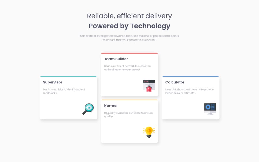
Hi Whiplink, try to decrease the font-weight for the h1 to match the design also, make the h3 up to h2 then decrease its font-size for Accessibility
1
Please log in to post a comment
Log in with GitHubJoin our Discord community
Join thousands of Frontend Mentor community members taking the challenges, sharing resources, helping each other, and chatting about all things front-end!
Join our Discord
