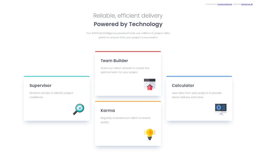
four card feature section (responsive) using css flex and grid
Design comparison
Solution retrospective
I am really happy that i implemented grid and flexbox concepts in this project.
What challenges did you encounter, and how did you overcome them?The challenge was to make the layout responsive in all screen sizes. I managed to do it with the help of CSS grid and flexbox.
What specific areas of your project would you like help with?Any kind of helpful suggestions...
Community feedback
- @Si1entERAPosted 7 months ago
Hello @MohammadAzmatAli
Congratulations on the completion of your project.
Your project looks amazing and just needs a bit more fine-tuning in your HTML.
You should try "semantic HTML tags" which can help organize your webpage into meaningful sections making it more readable, maintainable and is also good for SEO. You can replace "<div>" with "<section>" or "<article>"
Your project is truly amazing that I was inspired to make some changes to mine.
I hope you find this helpful, good luck on your journey.
Happy Coding.
0
Please log in to post a comment
Log in with GitHubJoin our Discord community
Join thousands of Frontend Mentor community members taking the challenges, sharing resources, helping each other, and chatting about all things front-end!
Join our Discord
