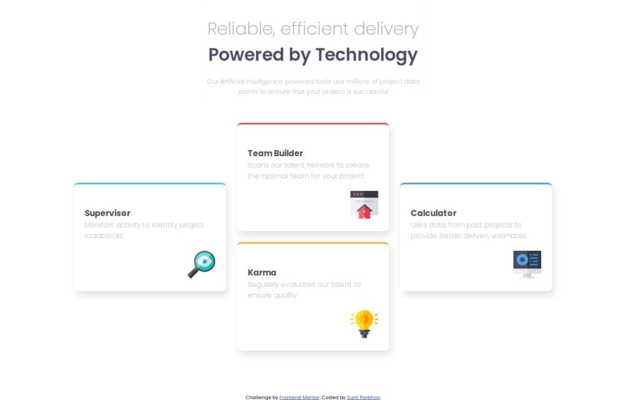
Design comparison
Solution retrospective
I am proud to complete the challenge of making the site responsive utilizing css grid and flex box along with media queries. I am using this as another project to hone these valuable skills. I may utilize rems instead of static pixels for the units of dimensions, but I did utilize the clamp method to allow for some flexibility.
What challenges did you encounter, and how did you overcome them?The challenge I encountered was estimating the sizes of elements without the use of Figma files. The desktop layout was a fun challenge that allowed me to hone my css grid skills and utilize grid-areas with grid-template-areas.
What specific areas of your project would you like help with?I welcome any constructive feedback that help me write more semantic, responsive, and professional code.
Community feedback
Please log in to post a comment
Log in with GitHubJoin our Discord community
Join thousands of Frontend Mentor community members taking the challenges, sharing resources, helping each other, and chatting about all things front-end!
Join our Discord
