Design comparison
Community feedback
- @correlucasPosted about 2 years ago
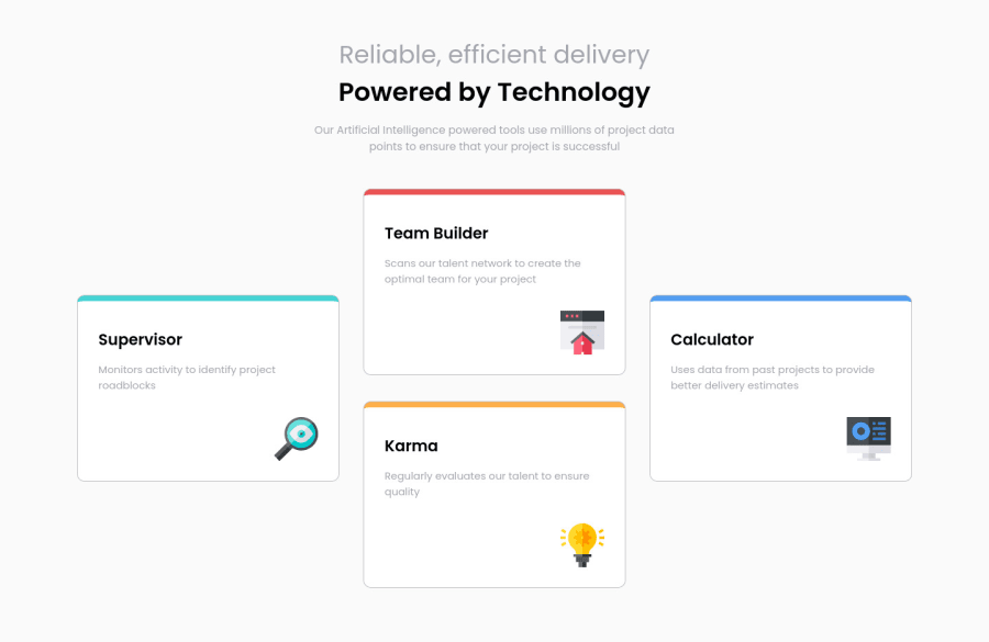
👾Hello @JulienLebron, Congratulations on completing this challenge!
Great code and great solution! I’ve few suggestions for you that you can consider adding to your code:
1.Improve the semantic replacing the
<div>used for the four cards and use instead<article>that is a better tag, remember that<div>doesn’t have any effective meaning is just a block elements, so for big block of elements use semantic tags.This a good resource to understand more about
semantic tags:https://www.w3schools.com/html/html5_semantic_elements.asp2.Think about using relative units as
remoreminstead ofpxto improve your performance by resizing fonts between different screens and devices. Anyhow, if we want a more accessible website, then we should use rem instead of px. REM does not just apply to font size, but to all sizes as well.3.The box-shadow is a bit too evident, this is due the
opacityandblur. The secret to create a perfect and smooth shadow is to have low values foropacityand increaseblurtry this value instead:box-shadow: 12px 7px 20px 6px rgb(57 75 84 / 8%);If you’re not familiar to box-shadow you can use this site to create the shadow design and then just drop the code into the CSS: https://html-css-js.com/css/generator/box-shadow/
✌️ I hope this helps you and happy coding!
1
Please log in to post a comment
Log in with GitHubJoin our Discord community
Join thousands of Frontend Mentor community members taking the challenges, sharing resources, helping each other, and chatting about all things front-end!
Join our Discord
