

Design comparison
SolutionDesign

Please log in to post a comment
Log in with GitHubCommunity feedback
- P@pawelni123
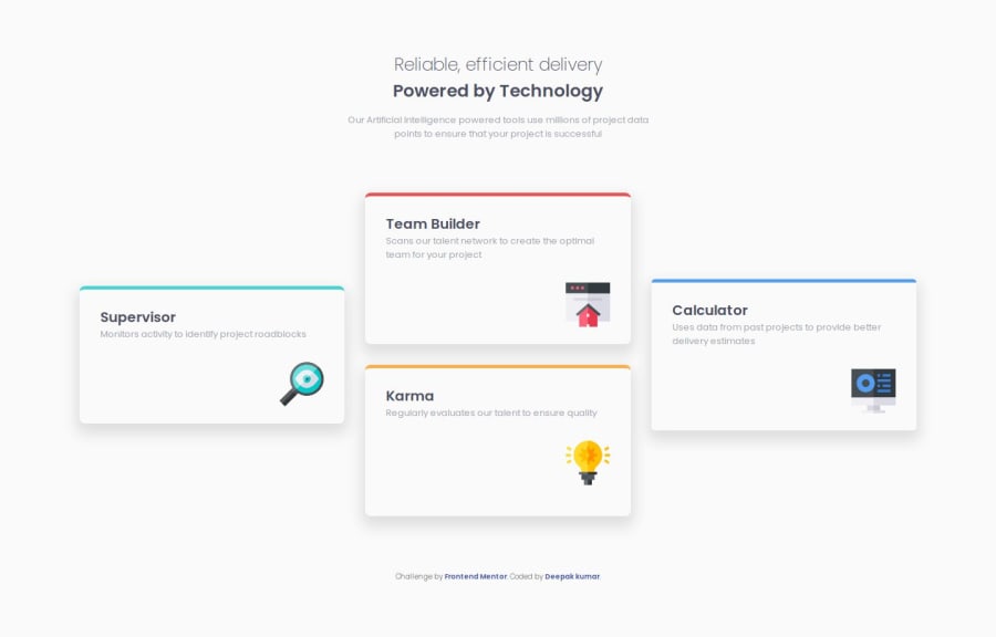
The mobile version looks fantastic – congratulations! As for the desktop version, I have a few remarks. First of all, the cards seem too stretched – try working on adjusting their width properly. As you can see in the original example, the words in the card descriptions are also positioned differently. I know these are small details, but I think setting fixed width and height values for the cards would help a lot. Overall, great job! Keep going!
Marked as helpful

Join our Discord community
Join thousands of Frontend Mentor community members taking the challenges, sharing resources, helping each other, and chatting about all things front-end!
Join our Discord