Not Found
Not Found
Not Found
Not Found
Not Found
Not Found
Not Found
Not Found
Not Found
Not Found
Not Found
Not Found
Not Found
Not Found
Not Found
Not Found
Not Found
Not Found
Not Found
Not Found

Submitted

four card feature section

CODE STEAL 680

@leandrorodrigues00

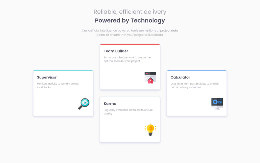
Desktop design screenshot for the Four card feature section coding challenge

This is a solution for...

  • HTML
  • CSS
1newbie
View challenge

Design comparison


SolutionDesign

Solution retrospective


Any feedback's to improve my future projects are welcome !

Community feedback

Danilo Blas 6,300

@Sdann26

Posted

Hi CODE STEAL!

I'm not saying that it's the right color, I'm not saying that it's the right color, I'm just saying that the design makes it look more like a light blue color, but I'm not saying that it's the right color.

That, if you can put a padding-bottom: 4em so that the bottom box is not too close to the edge, at least on my screen it looks stuck.

You have done it very well, the truth is that it has been spectacular, continue advancing like this! :D

Marked as helpful

1

CODE STEAL 680

@leandrorodrigues00

Posted

@Sdann26 I develop the sites with just the JPEG design. Without the Figma I get lost in the details haha !!!

Thank you very much for the feedback !!! I have already made the changes, It really got much better !

1

Please log in to post a comment

Log in with GitHub
Discord logo

Join our Discord community

Join thousands of Frontend Mentor community members taking the challenges, sharing resources, helping each other, and chatting about all things front-end!

Join our Discord