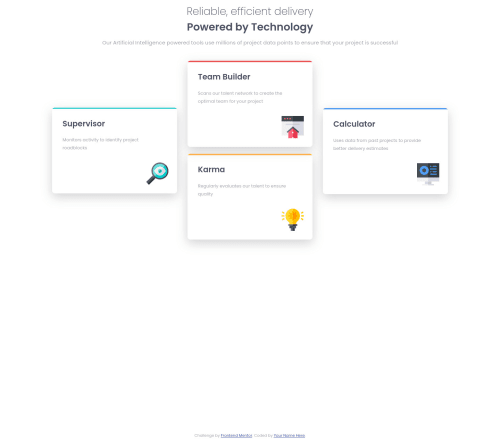
Four Card Feature Section

Solution retrospective
Hi. I'm not very proud on this one. I'm facing two issues :
-
Not responsive. I didn't now how to position the cards this way so I used position: absolute, and flexbox aren't flexible anymore. It just changes the way it displays if screen width is less than 1160px. I'm still wondering how to position it the right way.
-
I used "::before" to color each box but did not find a way to do it without rewriting the same piece of code four times.
Good luck to everybody on this challenge.
Edit : Changes have been made and everything's working good. Many thanks to you !
Please log in to post a comment
Log in with GitHubCommunity feedback
No feedback yet. Be the first to give feedback on pierre-pellegrino's solution.
Join our Discord community
Join thousands of Frontend Mentor community members taking the challenges, sharing resources, helping each other, and chatting about all things front-end!
Join our Discord