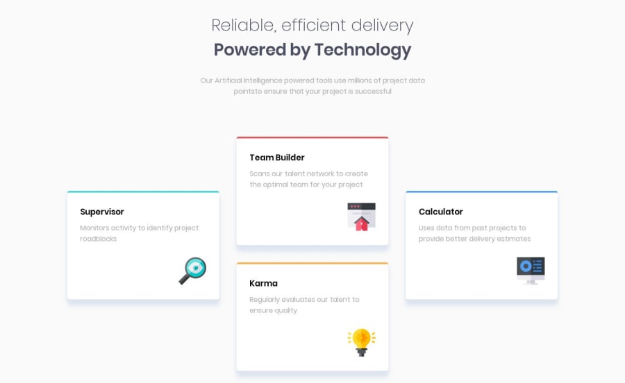
Design comparison
Solution retrospective
No question but i need feedback :)
Community feedback
- @argelomnesPosted over 4 years ago
hey Osvaldo,
I noticed the Karma card comes first before Calculator. This is a good start. Design-wise for mobile, I suggest writing your HTML the way the cards are ordered in mobile. And then use CSS to reposition them for desktop view. Nice work!
3 - @GerbenDolPosted over 4 years ago
For best practice purposes try fixing your HTML errors! It's best for all your images to have an alt-tag.
Even in cases where a description on the image would be unnecessary it's still better to set an alt, but leave it empty.
Read a bit more about it here: https://davidwalsh.name/accessibility-tip-empty-alt-attributes
2@osvaldoleivaPosted over 4 years ago@GerbenDol Hi I was fixed that problem but when i create a new report the problem still there, i commited to repo on github. thx for comment. sorry my bad english.
0@GerbenDolPosted over 4 years ago@VegaYed I think your solution on the live page isn't properly updated yet. It looks like the live location isn't getting your latest updates from your repo.
Anyways, I checked it on GitHub and it's looking good. 😁
0@osvaldoleivaPosted over 4 years ago@GerbenDol problem solved my bad, the url of live was wrong. thanks
1
Please log in to post a comment
Log in with GitHubJoin our Discord community
Join thousands of Frontend Mentor community members taking the challenges, sharing resources, helping each other, and chatting about all things front-end!
Join our Discord
