

Design comparison

Solution retrospective
I'm particularly pleased with the implementation of the CSS Grid layout. It provided a flexible and efficient way to structure the page and ensure consistent spacing across different screen sizes. The use of clamp() for font sizing was also a great choice, as it allowed for a balance between minimum, preferred, and maximum font sizes, enhancing the overall readability and responsiveness of the design.
If I were to redo this project, I would focus on streamlining the CSS by reducing the number of custom properties and potentially using a CSS preprocessor like Sass or Less for better organization and maintainability. Additionally, I'd explore more advanced grid techniques to create even more complex and dynamic layouts.
What challenges did you encounter, and how did you overcome them?One of the biggest challenges was achieving pixel-perfect precision when matching the design's typography. The custom font and specific measurements made it difficult to get an exact match using standard font families and units. To overcome this, I experimented with different font combinations to find the closest match. I also fine-tuned the font-size values and line-height using a combination of pixels and rems.
Another challenge was managing the complexity of the layout while ensuring responsiveness. I found that using a combination of grid, flexbox, and media queries helped me achieve the desired layout across different screen sizes.
What specific areas of your project would you like help with?I would like some advice in CSS maintainability.
Community feedback
- @grace-snowPosted 7 months ago
Hi,
I'm afraid you are making some serious accessibility mistakes in this from.your efforts to make this more accessible.
You need to remove the sr-only headings, header landmark and aria-labels from this solution, and use a heading for the heading content.
- the header landmark has a banner role. It's purpose is to hold repeating primary content across a site or set of Web pages. It shouldn't ever have page-specific content like headings inside it. This design only shows content that belongs in a main landmark, there is no header content in the design. WCAG criterion 1.3.1 Info and Relationships.
- this already has all the headings it should have. Don't add extra content for screen readers unnecessarily. People using a screen reader need to have an equitable experience. Don't force them to have to listen to and process even more information. This design already has a clearly visible h1 content. It must be marked up in the code as a heading, as this is what it is visibly presented as a heading. WCAG criterion 2.4.6 Headings & Labels. This should be one h1 with no extra sr-only headings anywhere. Remember you can set one line to display block in a span or strong so it is aligned on its own line.
- When a link has visible label text you mustn't set an aria label on it that differs. This can make it hard for people using speech control to activate the link as the programmatic link text will differ from the visible text. WCAG criterion 2.5.3 Label in Name. Adding unnecessarily long aria-labels on links also adds to the amount of information people using a screen reader would have to process.
- Looking at the images I think these icons should be considered decorative. They bring no extra meaning or value to the content in my opinion. If you consider them valuable content then they should still only have very short descriptive descriptions like "search icon illustration" not overly verbose ones. I would recommend empty alt on all of these (
alt="") so they are treated as decorative images. WCAG criterion 1.1.1 Non-text Content. - The font-size clamps are inaccessible on this because you are setting the size using viewport units. NEVER do this. I can't stress enough how bad this one is for users. It removes the ability to resize text. WCAG criterion 1.4.4 Resize Text. When using clamp for font size you must convert that center value to rem.
Well done on the use of clamp for the width though, that's a nice touch! Although I wouldn't expect this to need any more than 1 media query so do wonder if there is a mistake somewhere.
Other recommendations:
- it's better for performance to link fonts in the html head instead of css imports.
- all of the content is touching my screen edges at the moment. Add a little padding (inline) in px to the body or landmarks so this can't happen.
- try to reduce media queries. This really shouldn't need more than 1. If the issue is vertical margins making you think you need them, perhaps you should be using em units for that. See if you can reduce the need for so many media queries if possible anyway.
Marked as helpful2@flaviocmbPosted 7 months ago@grace-snow Thank you so much for your time and effort in evaluating this.
Let's break down the feedback:
- The header tag was removed and I also changed from a paragraph to a <h1> tag the words "Powered by Technology". ✅
- Aria-labels removed from the <a> tags in the footer. ✅
- The alt attributes are now empty. ✅
- Font links are placed in the html. ✅
- There's now only one media query. ✅
- The project is even more responsive at low resolution screens with margins on the edges. ✅
The font-size using clamps and viewport width are responsive design by following this guy Andy Bell. I recommend you to watch it. I updated the code for a middle ground here and now it looks a bit more fine and responsive in any number of font sizes of the browser:
font-size: clamp(1.5rem, 0.5rem + 5vw, 2.3125rem);0@grace-snowPosted 7 months agoWell done!
And @flaviocmb that's exactly what I advised on the clamped font sizes. See how the center unit is now converted to a rem value not just a viewport unit value. It makes all the difference.
Andy's resources are always great. There's a very good site about clamps called utopia you may want to look up of you haven't already.
1@flaviocmbPosted 7 months agoAs soon as I watched Andy Bell's video, as he mentioned utopia as his favorite site, I don't know anything better to calculate my ranges to clamp @grace-snow. That's an awesome tool!
1 - P@MikDra1Posted 7 months ago
Nice one 😀
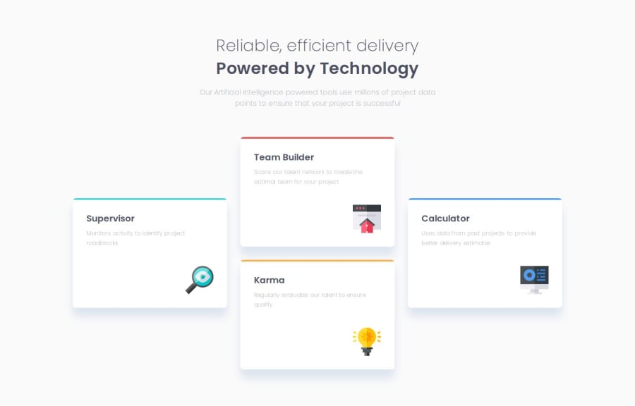
If you are curious how you can do this straight lines on the top of each card here is my tip:
Create another element in each of the cards. Then position this element absolute. Card should be positioned relative. At the end you need to give this element a height of 3px width of 100% and top 0 and left 0. You can also use ::after or ::before pseudo elements to create these.
Hope you found this comment helpful 💗
Good job and keep going 😁😊😉
2@flaviocmbPosted 7 months agoThank you @MikDra1
Just made the change. I used the pseudo-element.
.card::before {
    content: '';
    position: absolute;
    height: 3px;
    width: 100%;
    top: 0;
    background: #FFF;
}
1


Please log in to post a comment
Log in with GitHub
Join our Discord community
Join thousands of Frontend Mentor community members taking the challenges, sharing resources, helping each other, and chatting about all things front-end!
Join our Discord