Design comparison
SolutionDesign
Please log in to post a comment
Log in with GitHubCommunity feedback
- @moonji-spoonji
HI there! I think your solution looks great!
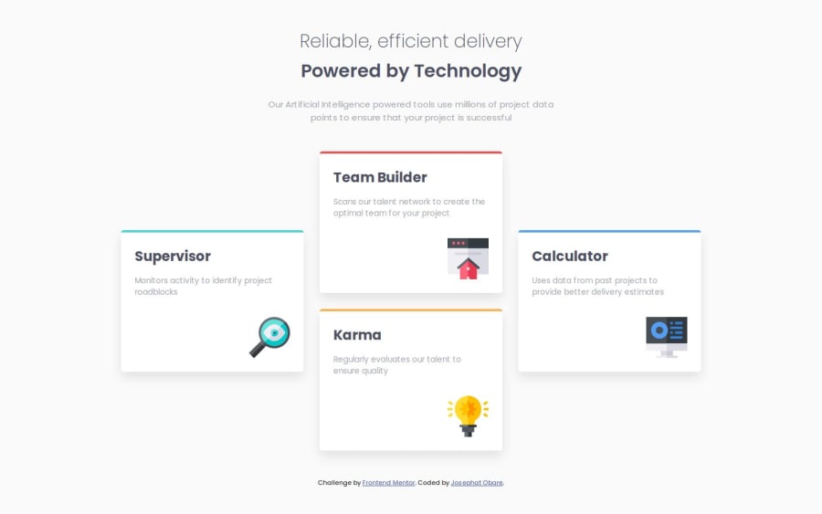
Here are some differences I've noticed between your solution and the design:
- your background does not reach the bottom of the page completely, I'm not sure what causes that to happen so I don't know how to solve that, but here's an article for something that might help.
- the distance between the title and the top of the screen is a bit small, you can easily improve this by increasing the padding to 4rem or more in your .main
- titles for each card are a bit too big or too heavy of a weight, so maybe try out font-weight: 400 or a smaller font-size.
- the line-height of the paragraphs within the cards are a bit small also, so maybe increasing it to 1.7rem might make it closer to the design.
Those are all my notes. I think you did a wonderful job, especially with the responsiveness!
Join our Discord community
Join thousands of Frontend Mentor community members taking the challenges, sharing resources, helping each other, and chatting about all things front-end!
Join our Discord
