Design comparison
SolutionDesign
Solution retrospective
What challenges did you encounter, and how did you overcome them?
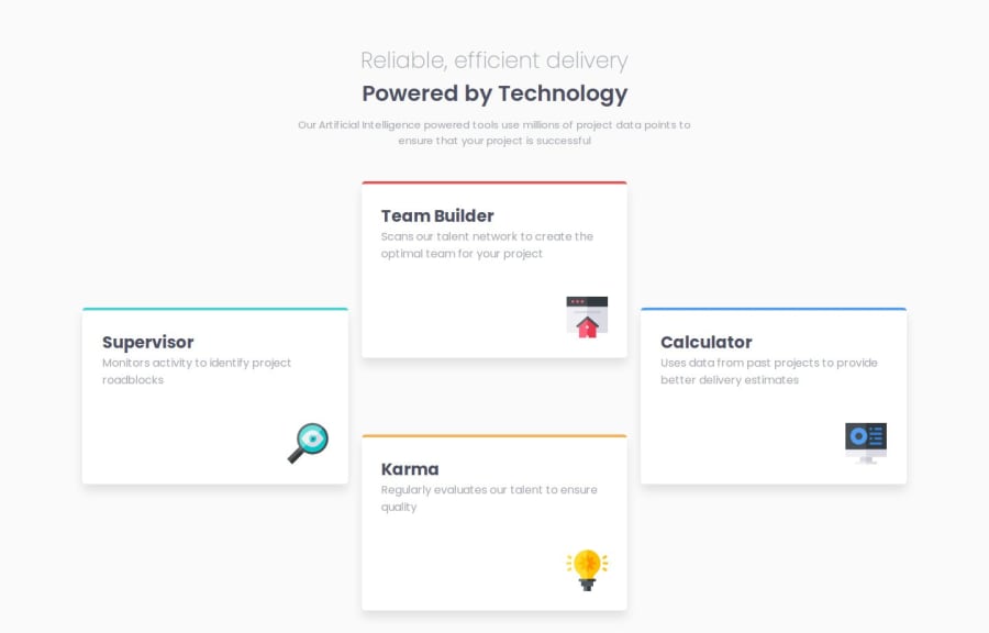
To decide whether to apply Grid or Flex in this case. I'm quite disappointed with this project because I spent too much time on fixing the layout as well as making it responsive. This is not really responsive when I try to reduce the screen size in a web browser, but it works when I use my mobile. I mean the boxes or the cards stack on each other in a column while it doesn't work the same on a web browser.
Please log in to post a comment
Log in with GitHubCommunity feedback
No feedback yet. Be the first to give feedback on Iceish96's solution.
Join our Discord community
Join thousands of Frontend Mentor community members taking the challenges, sharing resources, helping each other, and chatting about all things front-end!
Join our Discord
