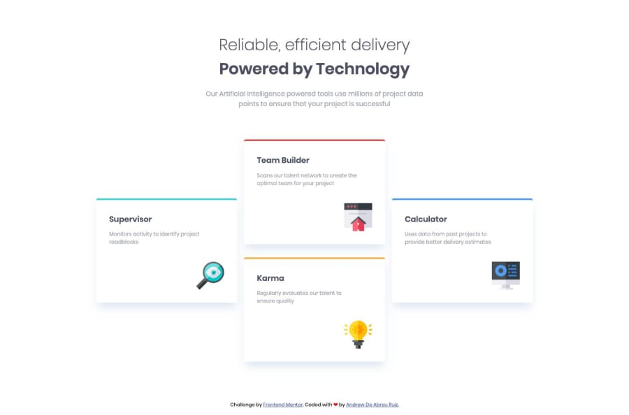
Four card feature section (only HTML5 and CSS3)


Design comparison

Solution retrospective
This is my first Frontend Mentor challenge and my first project with HTML5 and CSS3. I would appreciate if you could indicate problems and improvements to my code. Thank you!
Community feedback
- @AlexBueckigPosted about 5 years ago
Hi @andrewabreur,
your solutin looks great! There is only one small thing I'd change. If the screen gets really small the 4 containers get squished a lot before the media query kicks in and it looks kind of strange...
An easy work-around for this would be to get rid of your
width: 70%and only usemax-width: 1000px;in your.featuresclass instead! 😃 This will free up some room to the left and right on smaller screens to make it less squishy.If you want to get some whitespace between your elements and the edge of the viewport you can also just add a little bit of extra padding on the left and right aswell.
2@andrewabreurPosted about 5 years agoHi @AlexBueckig,
Thanks for your answer I have already applied it to the code.
0 - @mattstuddertPosted about 5 years ago
Hey Andrew, awesome work on this and congrats on submitting your first solution! Your project looks really good 👍
The HTML is great. The only couple of suggestions I'd have are with your CSS. First of all, I'd recommend reducing the specificity of some of your selectors. For example,
.features-cards .card .card-textcould be reduced to.card-text.Also, have you ever tried building using
min-widthmedia queries instead ofmax-width? Working in this mobile-first approach has the benefit of reducing the styles mobile users load in. Many developers also find it a simpler workflow.I hope these tips help. Let me know if you have any questions!
1


Please log in to post a comment
Log in with GitHub
Join our Discord community
Join thousands of Frontend Mentor community members taking the challenges, sharing resources, helping each other, and chatting about all things front-end!
Join our Discord