Design comparison
SolutionDesign
Solution retrospective
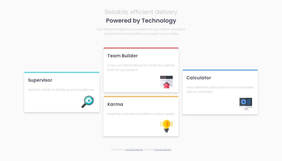
I didn't know how to make the code fit also for the mobile layout. If you can help me with that I'd really appreciate !
Community feedback
- @chri55Posted over 4 years ago
Nice work, Thomas. If you were to use a media query to change the flex direction of .boxes to be column at a certain point (at and below 750px would be my estimate), you can stack the boxes nicely. Then the inner boxes can also be allowed to take up more width.
I also liked your solution for adding the tops of the boxes using a border color. Well done!
1
Please log in to post a comment
Log in with GitHubJoin our Discord community
Join thousands of Frontend Mentor community members taking the challenges, sharing resources, helping each other, and chatting about all things front-end!
Join our Discord
